
There’s a peculiar magic to vinyl records. They weren’t just about the music — they were tactile, oversized canvases where artists and labels could project an image, a mood, a fantasy. Sometimes, though, those fantasies went spectacularly off the rails. Enter the world of “sexy” album covers that were prevalent during the 1970s and 1980s. It was a veritable parade of polyester, awkward poses, and misguided attempts at seduction that now read more like comedy than allure.
The era was ripe for this kind of misfire. Disco fever, glam rock excess, and the dawn of MTV created a culture obsessed with image. Musicians and marketers alike believed that sex appeal could sell anything. But when their version of “sexy” was wrung through the aesthetics of shag carpets, neon fonts, and questionable photography, the results were most often unintentionally hilarious. What was meant to smoulder ended up smirking; what was supposed to entice only embarrassed.
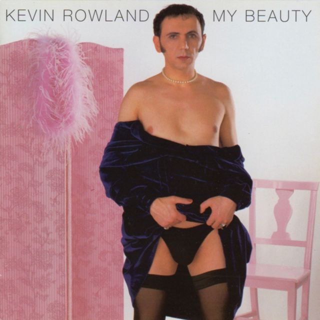
Look through the assembled album covers, and you’ll notice these recurring themes: shirtless men holding onto saxophones as if they were lovers; women who posed in ways that defy both anatomy and dignity; and couples who were locked in embraces that failed at looking passionate rather than the painfully staged specimen that it was. There’s the overuse of soft‑focus lenses, the obsession with leather and lace, and the inexplicable decision to set a “seductive” mood against backdrops like bowling alleys or suburban living rooms. It’s as if someone handed a photographer the word “sexy” and said, “Just wing it.”
What makes these covers so fascinating today is the cultural shift in how we read them. At the time of their creation, the musical acts’ and record labels’ art directors made honest, as well as earnest, attempts to exude both desire and glamour. Now, roll ahead to the mid-2020s, and these artifacts of kitsch are stark reminders that sex appeal is as much about context as it is about content. The very things that were supposed to make them alluring — the pouty expressions, the suggestive props, the exaggerated body language — are precisely what make them ridiculous to modern eyes. They’re not sexy; they’re camp.
And yet, there’s a kind of charm in their failure. These music album covers are time capsules of a special moment in music marketing when it was less polished, more experimental, and occasionally much more desperate. This work reveals the gap between aspiration and execution, between what artists thought audiences wanted and what audiences actually found appealing. In that gap lies humour, nostalgia, and a reminder that cultural tastes are never fixed — they evolve, and what once seemed daring can later seem absurd.
So laugh freely at these “sexy fails.” Marvel at the audacity of a crooner sprawled across a bearskin rug, or a funk band posing in satin shorts that leave little to the imagination. Cringe at the awkwardness, but also appreciate the sincerity. These covers weren’t ironic; they were genuine attempts to seduce. And that sincerity, misplaced as it was, is what makes them so entertaining now.
In the end, these albums prove a simple truth: sexiness can’t be forced. It’s not about props, poses, or polyester. It’s about authenticity — something these covers sorely lacked, and something that makes them, decades later, irresistibly funny.
There’s nothing less sexy than sexy-gone-mad, and these vintage vinyl covers are pure ‘sexy fail’ gold.
Oh, how you will laugh…
Subscribe to get access
Read more of this content when you subscribe today.


Subscribe to continue reading
Become a paid subscriber to get access to the rest of this post and other exclusive content.
